go directly to the text

The Late 1980's Galleries
Red - Blue Works Lobby

note: The late eighties were very productive years for Gerard: in order to accommodate the numbers of works we have divided this aspect of the gallery into several sections, of which this is Lobby. From this Lobby you can read Gerard's text or link to this series painting, drawing or sculpture galleries. To view all the works of eighties "please click here".


Red - Blue - Yellow Works Lobby

Paintings
Drawings
Sculptures
For paintings please click here.
For drawings please click here.
For sculpture please click here.

... please click one of the above images or text to advance to that section of the gallery ..
... please be patient on page loads these are large galleries ...

Work that predate or informs Red - Blue - Yellow from the 1970's
Lourdian Blinds 1977.
A Dream Memory of the Brace 1977.
Voor mij de Realitiet Schommelt (For me Reality Sways), 1979.
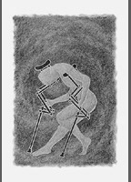
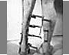
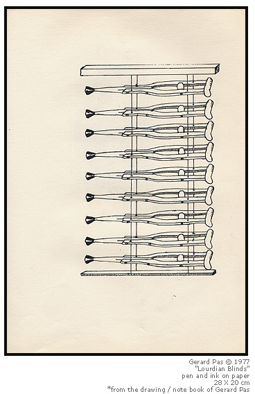
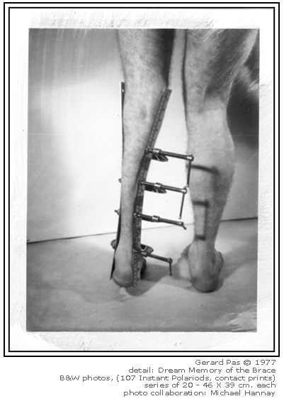
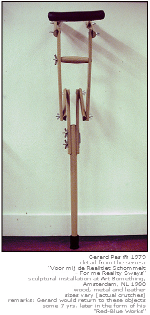
- The drawing on the left is taken from one of Gerard's first drawing books 1977.
- The black and white image is from the series "Dream Memory of the Brace" 1977. It played a pivotal role in the development of his work - being published worldwide.
- The crutch on the right is one of the sculptures from"Voor mij de Realitiet Schommelt" (For me Reality Sways). It was created and exhibited in Amsterdam, 1979.

sometimes it's difficult to visit our past if it is riddled with pain and consternation
but sometimes if we do we can also find resolve, redemption and healing
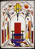

Red - Blue - Yellow Works Text
primary
and sometimes black white and grey
neutral
rarely green, orange or purple
secondary
but definitely never brown
tertiary
and then there's extreme contrast
complementary
This body of work represents one of the most prolific periods in Gerard's production. Red - Blue Works follow his performance days of the "seventies" through to his explorations of beauty and truth in the "early eighties". His "Red - Blue - Yellow" series combines all of what he learned through the previous years of experience, providing him with a formidable arsenal in addressing the issues of the day. It is indeed because of these deep personal experiences that this body of work is so candidly honest in its simplicity.
The following comments were first published in the 1987 catalogue "Less of More - More of Less" and are Gerard's 'Artist Statement.'
This catalogue can be read online here a gerardpas.com by clicking on the details just below.
Portrait of Gerard Pas by William Kuryluk 1989

Reprinted from the exhibition catalogue; "Less of More - More of Less (PaS Plus - PaS Moins)"
by Uli Bohnen and Gerard Pas
Pub: McIntosh Gallery, The University of Western Ontario, London, Canada. 1987.
copyright The McIntosh Gallery, The University of Western Ontario and Gerard P. Pas © 1987.

The Artists comments

PaS Plus - PaS Moins
(no more - no less)
by Gerard PaS

"The more man ripens, the more he will become a (creator) and the more he will oppose natural matter and those, who are still dominated by it. He will select his own surroundings and create them. He will therefore not regret the lack of nature, as the masses do, who have been forced in spite of themselves to leave it (......). He will build cities, hygienic and beautiful by a balanced contrast of buildings, constructions and empty space. Then he will be quite as happy indoors as outdoors." Piet Mondriaan
H.L.C. Jaffe, De Stijl, 1917-1931: The Dutch Contribution to Modern Art (Cambridge, U.S.A. & London, U.K.: Belknap/Harvard University Press, 1986), pp.156, 157.

"Disequilibrium means conflict, disorder. Conflict is also, part of life and of art, but it is not the whole of life or universal beauty. Real life is the mutual interaction of two oppositions of the same value, but different aspect and nature. Its plastic expression is universal beauty". Piet Mondriaan
H.L.C. Jaffe, De Stijl, 1917-1931: The Dutch Contribution to Modern Art (Cambridge, U.S.A. & London, U.K.: Belknap/Harvard University Press, 1986), p.127

The principle motivation behind this body of work is to present a problematical situation corresponding directly to one's cognition of reality, and reality's often relative perception.
More concretely, the ontological basis of these works Is one which is largely inspired by the aesthetics and works of the Supremacists, the Constructivists, the De StijI and the Neo-Plasticist movements in art.
By taking the above aesthetics, as well as my own existential experiences and then by reassembling them through a process of fragmentation, a new personal aesthetic vocabulary is created. This new language serves not only as a reflection of my own experiences with being handicapped, but also as a polemic to the aforementioned movements in art. Let me explain: it is my opinion that the previously stated art movements, in their development of the 'pure form' attempted to take these 'pure forms' and 'apply' them to general design and architecture resulting in some rather peculiar outcomes. For example, if you have ever sat in Rietveld's Red - Blue Chair, you would know that it can be very awkward and uncomfortable to sit in for long duration's. Consider the results of some Constructivist's architecture which has led to the current formation of prefabricated steel buildings, which dot the industrial parks of most cities. These buildings, which can be ordered in any colour or size from a catalogue, have neglected to consider the beings who inhabit them, making them somewhat uninhabitable in their consideration of 'pure form'. What started out as 'beauty' has turned to the 'beastly' techno-slums of our current age.
I would like to emphasize that the above applications do not necessarily disturb or anger me! Rather, I have come to see them in the context of 'pure forms'. The Red-Blue Chair is not really for sitting 'in': it is for seeing, filling negative space like sculpture, photographing, etc.; and likewise the Constructivist buildings are mammoth sculptures. I therefore conclude that these movements "sometimes" (not always) took 'pure forms' and disguised them as 'applied forms'. In other words: they took art and introduced it as practical design even though it was still art. You could then go forward and ask yourself, as the Dadaists did, "At what point does any common object become Art?" 
The root of my new work is based on this above conclusion. What I have done in my work is simply reversed the above process by taking 'applied forms' and, through a complex method of fragmentation and assimilation, created 'pure plastic forms'. For example, I have taken the practical (applied) form of a crutch and, reassembling its shape, changed it into the 'pure form' of a "plastic objet d'art". This process is then further applied as an assessment on the effects of the aforementioned aesthetic movements and influences, through art, into virtually all forms of contemporary design and architecture.
The work acts as both a vehicle to relate my personal artistic vocabulary (In dealing with my handicap) but also as a commentary on the effects of these already established influences on today's applied arts.

Gerard Pas - London, Canada. 1987


Other points of interest relating to these works:

As stated in the above text: these works are discussed in length in the following Catalogue and can be read here at www.gerardpas.com
"Less of More - More of Less (PaS Plus - PaS Moins)" by Uli Bohnen and Gerard Pas
Pub: McIntosh Gallery, The University of Western Ontario, London, Canada. 1987.
copyright The McIntosh Gallery, The University of Western Ontario and Gerard P. Pas © 1987.

These works were exhibited extensively around the world. For a summarized list please read Gerard's biographical data here at www.gerardpas.com. "A selected Curriculum Vitae, Biography, Resume..."
here are just a few examples from solo exhibitions with links to that institution:
1989 Red-Blue Works, Mercer Union - Centre for Contemporary Art, Toronto, Canada.
1988 PaS Plus - PaS Moins, The Walter Phillips Gallery - The Banff Centre for the Arts, Banff, Canada.
1988 Less of More - More of Less, The Kelowna Art Gallery, Kelowna, Canada.
1988 Pas Plus - Pas Moins, The Mclntosh Gallery, The University of Western Ontario, London, Canada
.

Work from this series has been included in The Government of Canada - Canada's Digital Art Collection web site (this an exceptional web resource on Canada's contemporary art, artists and their work).
The documentation and images are from Gerard's 1989 exhibition "Red - Blue Works" at Mercer Union - Centre for Contemporary Art, Toronto, Canada. This is an excellent resource with images and texts as well as an article by Jane Perdue.

These works were included in the exhibition "Hommage - Demontage" curated by Dr. Uli Bohnen.
List of venues: Neue Galerie-Sammlung Ludwig, Wilhelm Hack Museum, Stadtisches Museum Gelsenkirchen, Germany; Hedendaagse Kunst, Utrecht,The Netherlands; Provinciaal Museum Hasselt, Belgium; Museum Moderner Kunst, Vienna, Austria.

Artists included in the exhibition were: Mike Bidlo, Ronnie Cutrone, Braco Dimitrijevic, Erro (G. Gudmundsson), Rainer Gross, Christof Kohlhöfer, Vitaly Komar & Alexander Melamid, Alexander Kosolapov, Milan Kunc, Martha Laugs, Martin Lersch, Sherrie Levine, Nicolas Moufarrege, Gerard Pas, Elaine Sturtevant, Ulrich Tillmann & Wolfgang Vollmer.
A major catalogue/book was also published on the occasion of this the above exhibition, the details are as follows:
"Hommage - Demontage", by Uli Bohnen. Wienand Verlag, Cologne, Germany. 1988.

Works from these series have also been included in the following books, both available in print.
- "Sights of Resistance", Robert James Belton, Dean of Arts - Okanagan University College, British Columbia, Canada. The University of Calgary Press © 2001. ISBN 1552380114 hardcover with CD-ROM University of Calgary Press, 2500 University Dr. NW, Calgary, Alberta, Canada, T2N 1N4.
- "Appearance & Reality - A visual Handbook for Artists, Designers and Makers," by Stephen Hogbin; Cambium Press © 2000, Bethel, CT, 06801, United States of America. ISBN 1-892836-05-X


Other points of interest:
* Note: "I have included the following links as a pedagogical tool for those who may not know of the art movements, or artists discussed on the pages of Red Blue Yellow Works." Gerard Pas
- Learn more about De Stijl or Neoplasticism or Read more on De Stijl from this excellent resource
- Learn more about Suprematism
- Learn more about Piet Mondrian
- Learn more about Kazimir Malevich
- Learn more about Gerrit Rietveld
- Learn about Rietveld's Schroeder Schräder House
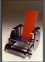
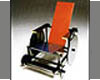
- Learn more about Rietveld's Red Blue Chair
- Learn more about Theo van Doesburg or See a short film on his works
- Learn about J.P.P. Oud designer of Café De Unie
- Learn 
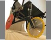
about Vladimir Tatlin and Constructivism
- or see images from Tatlin's Monument for the Third International
- See an example of Otto Freundlich's work as part of MOMA's Provenance Research Project


please click any of the above images to advance to that section or gallery

Return to top of page.Back to Late 1980's Galleries Lobby
© Gerard Pas www.gerardpas.com